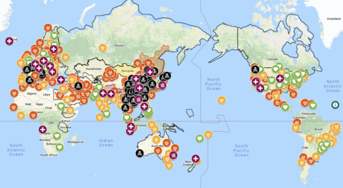
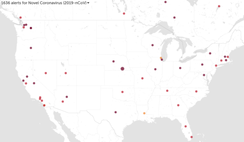
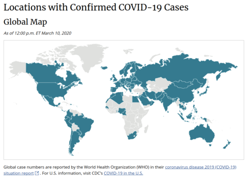
In our much-hyped age of big data and analytics, one might expect to find a plethora of useful virus tracking tools to help us all stay safe. Do you know which global map this one is from?
Now that the deaths in Seattle officially are more than Beijing, and it’s believed virus carriers moved about Washington State for six weeks undetected and untested (450 total Americans have been tested, versus 10,000 Koreans tested per day)… visualizations of a pandemic in the US are extremely important for any safety operations center hoping to update executive management.
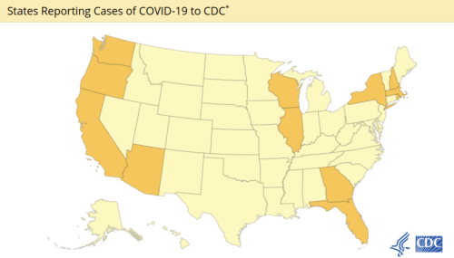
Instead of many, there are but a handful of options so far and some major differences. The CDC (American federal agency) for example is by far the worst of all. So let’s start there:
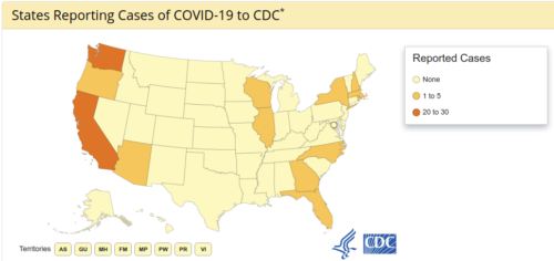
1) CDC is literally a state-level yes/no, is updated only once a day and appears very far behind current news. It’s essentially useless, which coincides with emerging reports of incompetence, corruption and unpreparedness.
The federal government’s anti-science faith-based response right now reminds me very much of IT executives who used to say they don’t need anti-virus software (test kits to show evidence of viruses) because they have not yet seen evidence of viruses.
True story: one time I stepped in to help a giant global company that refused to pay for anti-virus. Their faith-based management style couldn’t accept they had viruses (despite mounting numbers of computers going offline, costing them many thousands in downtime and help-desk hours).
Using basic statistics I convinced them I could bring costs down (music to their ears, despite refusing to hear that they had viruses).
Deploying anti-virus agents ($8/system in those days) meant I quickly was able to both prove there were large infections and explain exactly why they were happening (staff ran unpatched windows systems to secretly browse gambling and sports websites — get-rich-quick schemes).
Support costs plummeted from that tiny investment in science, company productivity and up-time returned, and security looked like a hero (because money was saved, not because basic science was proven to work).
That’s what I think of when I read American news stories like this one about Woz:
We have not been able to get tested [for coronavirus] in this country’…[The co-founder of Apple] said he reached out to the CDC, but received a form letter reminding the couple to wash their hands.
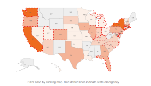
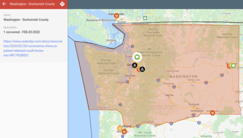
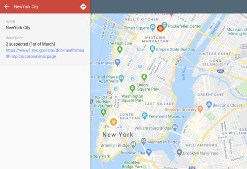
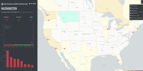
2) For comparison Avi Schiffmann, high schooler in Washington State, has created the best map nCoV2019.live from multiple feeds and levels of classification (reported, tested, positive, negative)
It keeps up with the rocketing death tallies in Seattle.
It shows the 2 cases in NYC.
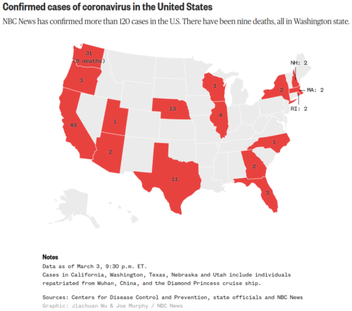
3) The NBC map is pretty good, although not interactive, staying up to date and showing case numbers (9 dead in Seattle, 2 under treatment in NYC)
4) A Johns Hopkins map uses CDC and WHO data, although unlike nCoV2019 I had a hard time getting it to reflect current news (e.g. two cases in NYC sparking intensive searches, yet none show on the map)
5) HealthMap has more details and it’s news driven only. So those Texas dots actually represent stories that mention quarantine going well, not more important stories like the CDC “mistakenly” released virus carriers from quarantine into a busy shopping mall, let alone the numbers affected. It is basically impossible to see from the dots what’s going on in Seattle.
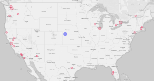
6) CoronaVirus.app is a weird one as it puts the Princess cruise ship dot in the middle of the US, as if it docked on the border of Kansas and Nebraska
7) University of Washington is missing a lot of data, although it does show the rapid rise of deaths in Seattle
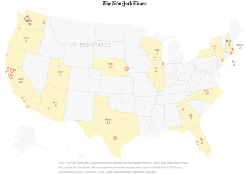
8) The NYT map has very up to date numbers, and like NBC isn’t interactive at all. Unlike NBC, there are no fatalities shown by NYT. It’s mostly eye-candy for a story that follows as you scroll, which reveals that community spread is known to be happening all over the West Coast of the US even though testing has barely started.
In terms of raw statistics, and given that preliminary data says 3.4% of Covid-19 cases have been fatal (far higher than flu), JAMANetwork and Stat both provide the following:
- 87% of China cases were in people ages 30 to 79
- 8.1% of cases were 20-somethings, 1.2% were teens, and 0.9% were 9 or younger
- 2.3% of confirmed China cases died with fatality rate of 14.8% in people 80 or older
- 1.3% China fatality rate in 50-somethings, 0.4% in 40-somethings, and 0.2% in people 10 to 39
- About half of the 109 Covid-19 patients (ages 22 to 94) treated at Central Hospital of Wuhan developed acute respiratory distress syndrome (ARDS), in which fluid builds up in the small air sacs of the lungs.
- Half of ARDS patients died, compared to 9% of patients who did not develop the syndrome.
- ARDS patients had an average age of 61, compared to an average age of 49 for those who did not develop ARDS
- China fatality rates are 1.7% for women and 2.8% for men
- High fatality rate of Covid-19 in already-sick people might result not from the virus but from an exacerbation of existing disease. About 60% of U.S. adults have at least one underlying health condition
If you know of any others feel free to add in the comments or send to me and I’ll add them here.
Update March 4th: CDC has improved their map from binary yes/no to reflect number of cases per state. It’s still far behind other maps in accuracy and timeliness. Texas is set on the map to “none” for example despite multiple news sources publicly discussing CDC mismanagement of its own cases in Texas (at least six under quarantine at Lackland Air Force Base, one released into Texas prematurely).
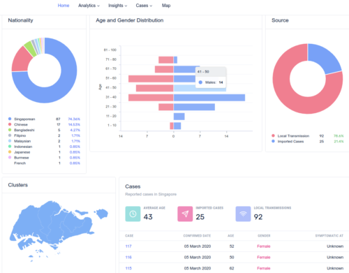
Update March 5th: Singapore has an amazing dashboard at co.vid19.sg, better than everything else I’ve seen so far and more what one should expect from a government.
Update March 10: It’s been many days of errors and yet CDC maps still are broken; aren’t showing Alaska as part of the United States.
The 1point3acres “real-time” update map is good, making state tallies easy to see and clickable to see latest reports.